What is the Color Picker Feature?
Use the Color Picker feature to change your site's design with custom and saved color schemes.
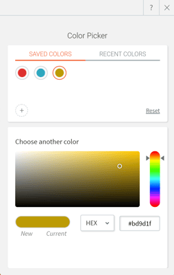
Color Picker is the function of your editor that lets you manage color scheme of text, background, overlays and more. You can choose a color from the color palette, input a HEX or RGB value or even create a custom gradient. Recent colors feature will help you keep your color scheme consistent and maintain a professional look and feel on your site.
When working with the Color Picker, you have the following options:

COLOR STYLE
Before you pick the color scheme, you need to choose where you want to use single color or a gradient.
If you are using single color option, you can pick a color from Recent colors tab or jump to Choose another color.
Gradient background will be an available option for row, column and widget backgrounds and image overlays. To apply a gradient, make sure to:
- Pick 2 colors of the gradient stops
- You can reverse the colors to adjust the stops positioning
- Choose gradient direction
- Center option will generate radial gradient
- Side options will create linear gradient
SAVED COLORS
Save colors that are frequently used across your site by adding them to the Saved Colors list in the color picker.
To add a color to the saved colors, click the Saved Colors tab on the color picker and click the + icon. To remove a color from the Saved Colors list, right-click the color and select Remove.
You can save up to 48 colors and gradients in the Saved Colors list.
RECENT COLORS
When picking a color, the recent colors menu shows a sample of colors that were recently used in your site. This allows you to quickly pick colors that are already on your site.
CHOOSE ANOTHER COLOR
Select a color's hue using the color palette on the right or the color panel. Alternatively, you can enter the HEX or RGB value of the color you want in text box below the vertical color gradient.
OPACITY
The opacity slider determines the transparency of an element. Keep in mind that as you reduce an element's opacity, whatever is behind it (background image or color) will begin to blend with that element.
Considerations
- Gradient is not available for text elements, so you will not see it in a Color Picker for text elements in widgets design editor of Global Design tab.
- When working with backgrounds, switching between Color and Image will set the settings on the previous option to null. To give an example, if you were using a color and changed the setting to Image, any color or gradient settings will be removed.
- Gradients override individual button backgrounds. To change them back, reselect the background for individual buttons.